Yesterday, I updated my blog to use webfonts. As I was curious how they look on different platforms in different browsers I made some comparisons. I tried to cover all major browsers on various operation systems. As a rendering example I took my blog post about AirPlay Simultaneity as it uses three different fonts within the first paragraph.
For each browser/platform combination I made an image consisting of an overview of the rendering and a detail view. On the left side of each picture you can see a simple screenshot which is displayed in such way that it is scaled by one over device-pixel-ratio. That means, that all PC screenshots are displayed 1:1, where as the iPad 3 screenshot is display at 50 % and the Nexus 7 at 75 %. On the right side is a zoomed view of a few characters of each font used. It is displayed with a magnification factor of 4 for the mobile devices and 5 for the PC devices.
Windows

Windows 7 SP1 / Internet Explorer 10
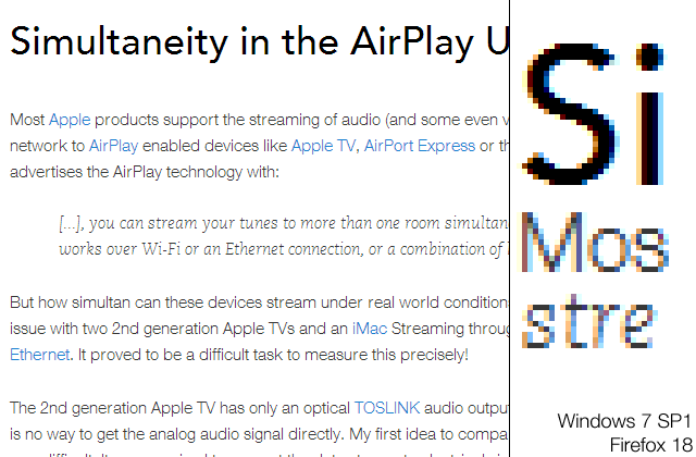
Windows 7 SP1 / Firefox 18
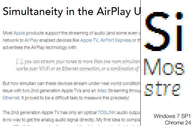
Windows 7 SP1 / Chrome 24
The Internet Explorer 10 has the best font rendering in Windows in my opinion. Especially the capital S from the header looks very pixelated in Firefox and Chrome. In the magnified view it is easy to spot that Internet Explorer does the hinting and especially the subpixel rendering different from Firefox and Chrome which look very similiar.
OS X
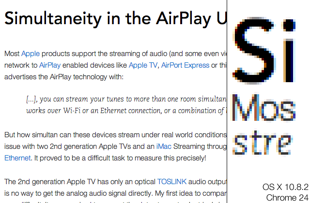
OS X 10.8.2 / Chrome 24
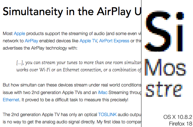
OS X 10.8.2 / Firefox 18

OS X 10.8.2 / Safari 6
In OS X all three browsers look very similar and seem to use the same API for rendering. I like the rendering a little bit better than Internet Explorer 10 on Windows.
Ubuntu
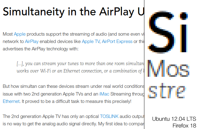
Ubuntu 12.04 LTS / Firefox 18
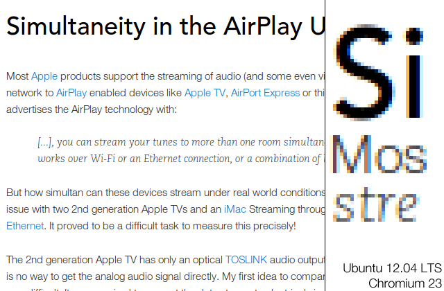
Ubuntu 12.04 LTS / Chromium 23
In Ubuntu both browsers look also very similar. In my opinion the quality of the rendering is about the same as Internet Explorer 10, but not as good as the OS X browsers.
Mobile
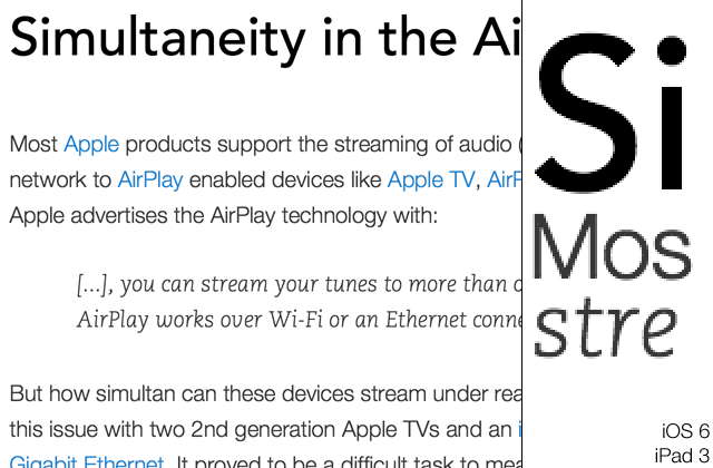
iOS 6 / iPad 3

iOS 6 / iPad mini
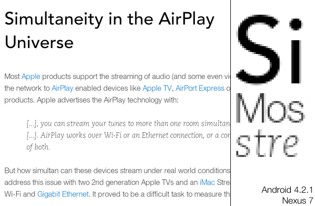
Android 4.2.1 / Nexus 7
The iPad mini and the Nexus both have a nice rendering. I like the iPad mini one a little bit more as it has more contrast. The rendering of the iPad 3 with its retina display is out of comparison.
Conclusions
Overall the quality of the rendered webfonts is very good. Only Firefox and Chrome running at Windows could not persuade me. As a Mac/Linux user I'm happy that I don't have to choose between the devil and the deep blue sea. I was surprised of the quality of the rendering in Linux as many applications there still have a very bad font hinting. It is noteworthy that the rendering seems to be more dependent of the OS and its rendering API than on the browser itself.
The mobile devices look all very good and easily keep up with all the PC based browsers. The retina iPad in special looks just gorgeous. I can't wait to have a retina screen on my iMac.
I'm eager to hear which renderings do you like most!